Our alphabet is a system of signs whose interaction allows for the visual functioning of language. Each sign has its own characteristics, but the aspects it shares with the rest of the letters in the system help us recognize them as belonging to a same group.
The typeface family is a set of alphabetic and non alphabetic signs which share structural and stylistic characteristics, allowing us to recognize them as belonging to a same system. A family, from the point of view of design, is a visual program par excellance.
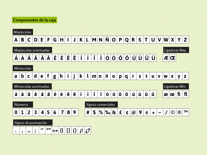
The alphabetic signs that compose the typeface family are capitals, accentuated capitals, tied capitals, lower case, accentuated lower case, joint lower case. Non alphabetic signs are numbers, punctuation marks and commercial signs.
There are families that include a third group of signs: the small caps, smaller capitals signs. We can conclude that all the elements necessary to write any kind of text genre in several languages are designed within a typeface family.
When the printing press used lead types, these were kept in a particular order in the «case». This case had two shelves, an upper one that contained capital letters and a lower one that kept lower case letters. Thus the names of capitals and lower case for the two alphabetic systems.
In Spanish we often find the term «burro» or «chivalete» to refer to the type case.
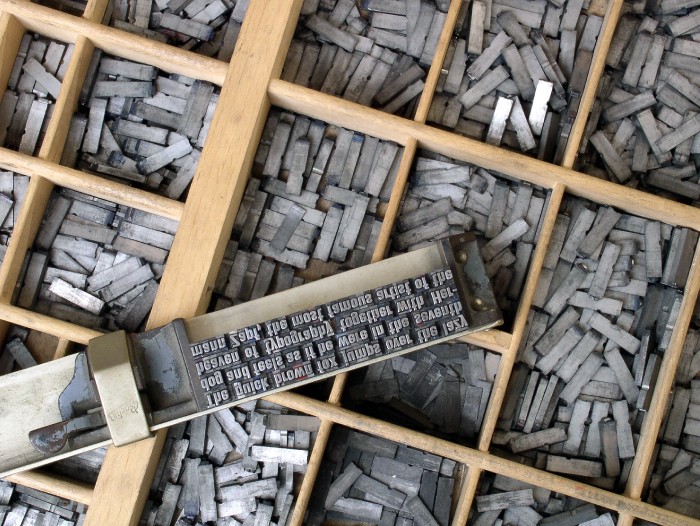
Tipos distribuidos en un cajón de un chibalete. En el componedor se pueden ver varias líneas armadas. Foto: Willi Heidelbach
The names of the components of the type case for the sets of all types, be them alphabetic or not, of a typeface family come from the times of the printing press, where lead characters were ordered by families.
There is a kind of diversity in the components in each family, some families being more complete than others.
Typography, apart from functioning as a graphic form of language, also has a structural and stylistic dimension that allows each family to have unique connotations. In order to be effective, visual communication needs to establish different levels of reading, that correspond to the hierarchy of a text.
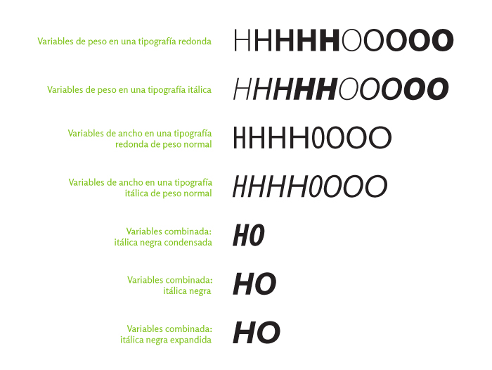
Typography solves this problem in different ways. In this case we will analyze the tools provided by the typeface family to establish levels of reading. Typographic variables represent alternative alphabets within the same typeface family, thus they maintain the criterion of structural and stylistic relation.
This alternative alphabets are variables that allow solving different rhythms or weights, but within the same sign system.
First, variables affect the letter in three possible aspects:
- weight (light, regular and bold)
- axis (round or regular or roman and italic)
- width (condensed, regular and extended)
- El peso modifica el trazo de la letra y por lo tanto su color; el eje cambia la estructura, por lo que produce cambios en el ritmo; y el ancho modifica la estructura de los signos, cambio que se hace evidente en el cambio de las contraformas, además de producir modificaciones en el rendimiento del texto.
- Weight basically modifies the stroke of the letter and thus its color, the axis changes the structure and thus it produces changes in rhythm and width basically modifies the structure of the sign, this is very evident in the change of counterforms and produces changes in text performance.
- Each of these variables has different uses within a text and even though there is a certain tradition they should be tested and verified by the student.
- There are some typeface families that present stylistic variables, such as from serif to sans.
Bibliography
- SOLOMON, Martin. El arte de la tipografía, Tellus, Madrid.
- RUDER, Emil. Manual de diseño tipográfico, G. Gili, Madrid.
- FRUTIGER, Adrian. Signos, símbolos, marcas y señales, G. Gili, Madrid.
- DE BUEN UNNA, Jorge. Manual de diseño editorial. 3.ª edición, corregida y aumentada. Trea Ediciones, España, 2009.
- MARTINEZ DE SOUSA, José. Manual de edición y autoedición, Pirámide, España, 1999.

This entry is also available in: Spanish