Typographic classification
Those ambiguities, redundancies and deficiencies remind us of those Dr Fanz Kuhn attributes to a certain Chinese encyclopedia called Celestial Emporium of Benevolent Knowledge´s Taxonomy. In its remote pages it is written that the animals are divided into: (a) belonging to the emperor, (b) embalmed, (c) tame, (d) sucking pigs, (e) sirens, (f) fabulous, (g) stray dogs, (h) included in the present classification, (i) frenzied, (j) innumerable, (k) drawn with a very fine camelhair brush, (l) et cetera, (m) having just broken the water pitcher, (n) that from a long way off look like flies.
Jorge Luis Borges. “El idioma analítico de John Wilkins”, en Otras Inquisiciones, Buenos Aires, Emecé, 1996.
from giving us several typographic , stylistic, historic, and cultural references.
Classification systems based on historic criteria are useful to analyze typography designed up to the mid-20th century. It is useful to know them in order to understand the influence the merging of new technologies and the better use of ancient knowledge had on the evolution of typographic design, apart from being a great tool to strengthen historic associations or for the search of families in catalogues. There have been many attempts to establish a classification system capable of arranging the existing typographic styles. The main ones are:
1921 Francis Thibaudeau. He organizes his classification in 4 styles, basing it in the contrast of strokes and stems terminals.
1954 Maximilien Vox. He proposes a historic classification, this is one of the best known models. It includes 9 styles.
1958 Aldo Novarese. Based on the Thibadeau system, he establishes 10 styles differentiated depending on the morphology of terminals.
1962 DIN 16518-ATypI (Association Typographique Internationale). It adopts and completes the system developed by Vox. (10 styles)
1963 Giuseppe Pellitieri. He establishes a morphologic classification of 10 styles, based on the differences between strokes and terminals.
1965 British Standards Institution (bs 2961 system) (9 styles)
1979 Jean Alessandrini. He also bases his classification on morphologic characteristics. He establishes 15 different styles.
1992 Christopher Perfect. He adopts a historic criterion to establish 7 styles.
1997 Robert Bringhurst. He relates typographic styles to main artistic movements. He defines 8 styles.
There are many ways to classify and many different classification systems, but regardless of the system we adopt, we have to know which things to analyze in typeface families in order to decide how to group them or how to separate them.
XVth Century
1450 Johannes Gutenberg, in Germany, uses for the first time the movable type printing. The first lead types tried to imitate the calligraphy with which handwritten books were written.
1470. In Venice, type carvers took humanist writings as a model.
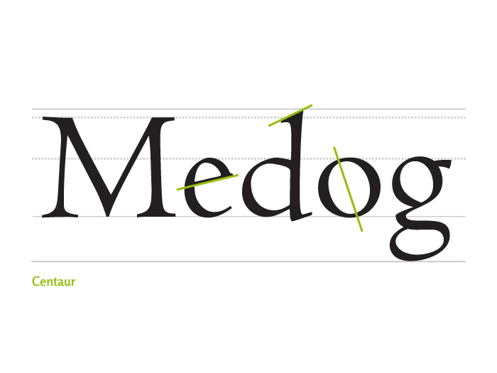
1470 Roman or Venetian Humanist
- Gradual light contrast stroke. The modulation axis is oblique and very tilted.
- Short and thick terminals, oblique ascenders.
- Little or no difference between the heights of capitals and ascenders.
- Tilted “e” crossbar.

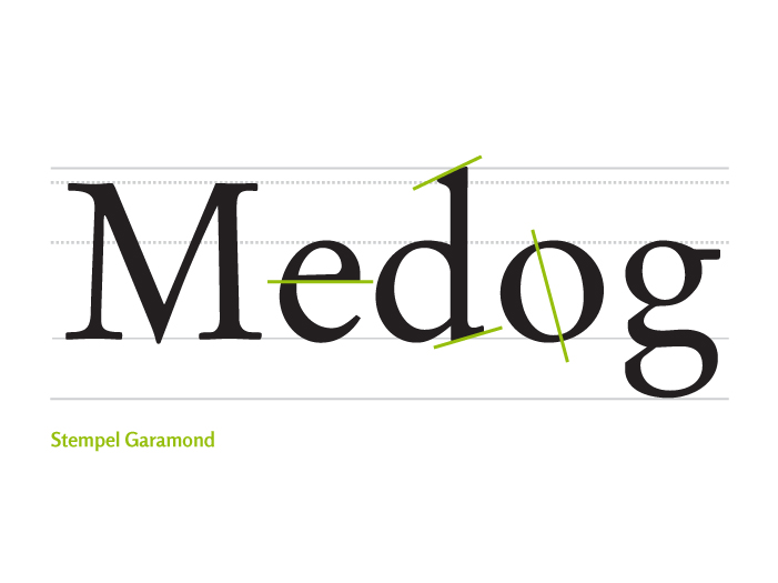
1490 Oldstyle Roman
- Gradual medium contrast stroke and oblique modulation axis
- Light and sharp terminals, oblique ascenders and in lower case support.
- Capitals height is lower than that of ascenders.
- Horizontal “e” crossbar.

XVIth Century
1501 Francesco Griffo carved the first italic characters at the request of Aldo Manuzio. The spreading of the printing press throughout Europe promoted the growth and improvement of characters design. Carving techniques and the craft of engraving types evolved allowing for finer and more precise corrections.
XVIIth Century
1692 Louis XIV ordered an experts committee to develop a new type the characters of which had to be created based on scientific principles. The engineers who were summoned defined this type of letter with rigorous geometry; Louis Simonneau engraved the matrix on copper sheets and the typographer Grandjean engraved the moulds to reduce the master alphabet to the type of text which will be known as Romain du Roi (King’s Roman).
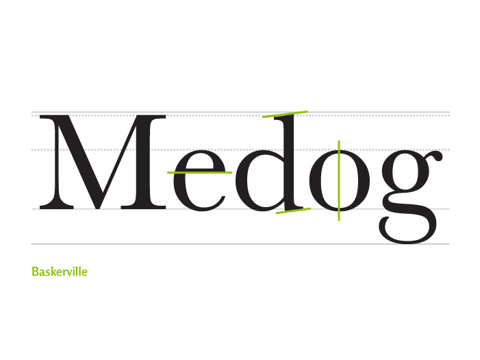
1690 Transitional Roman
- Gradual medium or high contrast stroke. The modulation axis is vertical or almost vertical.
- Light terminals, slightly oblique or horizontal ascenders and lower case support.
- Capitals height is lower that that of ascenders.

XVIIIth Century
Typography became a more formal discipline; the development of theoretical content is reflected by the number of typography manuals that were published at this time.
1700 John Baskerville improved the press, the papers and the inks used for printing.
1764 The Didots improved the system of typographic measurement.
1780 Modern Roman
- Gradual high contrast stroke and vertical modulation axis.
- Filiform terminals.

XIXh Century
Industrial revolution brought about mass production. The advertising needed to sell those products demanded new kinds of more flamboyant letters. The invention of the pantograph carver made the development of new typographic designs more accessible. With the invention of linotype (in 1886) and monotype (in 1887), the composition of texts became a mechanic process.
1810 Mechanic or Egyptian
- Uniform stroke (or gradual of little contrast and vertical modulation axis).
- Straight terminals, with the same(or almost the same) width as the stroke.
- High x height

1810 Grotesque Sans serif
- Uniform stroke or with little contrast between thin and thick (vertical modulation).
- High x height.
- Slight squaring of curves.

XXh Century
1954 Commercial photocomposers began to be used. Typography can be superimposed and distorted.
1985 Apple launched the Macintosh and the laser printer together with the first desktop publishing programs. With the Internet, digital typography working in the multimedia environments, added new dimensions to written language.
1920 Geometric Sans serif
- Uniform stroke.
- Synthetic structures based on simple geometrical figures.
- Many times the «a» has no ascender stroke.

1920 Humanistic Sans serif
- Uniform or slightly gradual stoke • Based on classic structures.
- Letter «a» has ascender lace.
- Generally the letter«g» has a closed tail and ear.

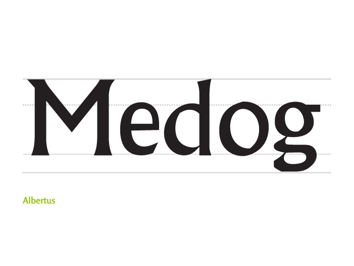
1930 Hybrids o glyphic
- Gradual stroke.
- Based on classic structures.
- Triangular terminals, inspired on letters carved on stones.

1985 Electronic
The stroke and interletter space are based on the pixel to function on the screen. Each size needs a specific drawing.

Let’s review other criteria for classifying fonts that are not based on historical periods, but rather in the arguments or evidence used to design inspiration. These fonts generally are not recommended for long or compose texts in small sizes. Some possible discussion groups for families who were excluded are:

Bibliography
- MARTINEZ DE SOUSA, José. Manual de edición y autoedición, Ediciones Pirámide. 1999.
- HALLEY, Allan. Hot designers make cool fonts. Rockport Publishers. 1998.
- CEREZO, José María. Diseñadores en la nebulosa. Editorial Biblioteca Nueva. 1997.
- BLACKWELL, Lewis. Tipografía del siglo xx. Remix. Editorial Gustavo Gili. 1998.
- DE BUEN UNNA, Jorge. Manual de diseño editorial. 3.ª edición, corregida y aumentada. Trea Ediciones, España, 2009.
- GÁLVEZ PIZARRO, Francisco. Educación tipográfica, una introducción a la tipografía, Universidad Diego Portales, Chile, 2004.
- BRINGHURST, Robert. Los elementos del estilo tipográfico, Libros sobre libros / Fondo de Cultura Económica, México, 2008.
This entry is also available in: Spanish
